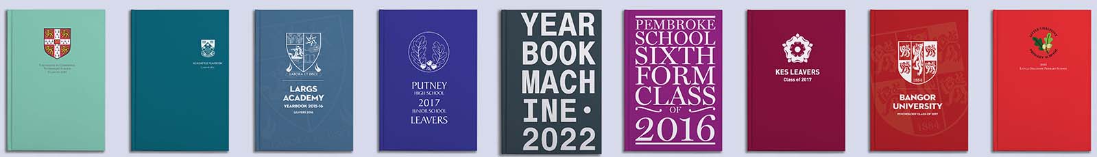
With a selection of templates on hand, we try to make sure that creating a great cover for your yearbook is an easy process. Sometimes, however, you might want to add a photo, change up the colours or even create something completely custom. We spoke with a graphic designer about her tips to create an amazing cover for your book. In this case – it’s not only the inside that counts.
Hi Carlyne! Let’s start with the big questions – how do you make your cover stand out?
There are many ways to make a cover stand out, but I do think it’s important to keep in mind “less is more”, only keep the information that matters and be creative around it. You can have a mix and match of illustration, texts, pictures, just keep in mind the hierarchy. Ask yourself: What is the most important information? Do we want to focus on the name of the school, the year or the logo? From that, you can have the structure of your cover and your design will hold altogether.
Great! How about the text, what’s best to put on a cover?
The title is the most important, of course, and the year. You don’t need any other things in my opinion, text-wise, as everything else will be inside. If you’re following yearbooks from previous books, it may be nice to continue with the same text as previous years. I would put the title of the school and the year of the book on the cover. Sometimes, I like to consider the logo as a signature where it’s important enough to be on the cover but it doesn’t need to take too much space – but that’s up to you.
And for the fonts or typography – what would you go for?
There are plenty of typefaces out there, and it can be overwhelming to try to choose one. That is why many graphic designers tend to have a couple of favourites and use them a lot. You can use any style, but in my opinion, it needs to reflect the theme of your book. Designer Anneke Short once did a poster saying “comic sans is never an acceptable font. Unless you are an 8 years old girl writing a poem about unicorns”. And if you are not sure, stay simple.
What if editors choose to have a photo cover – how do they pick an image?
There is no rule for that again, you can be creative. It could be a photo that will be displayed later in the book, your favourite one of the school, or a photo of all the students. The cover is a display, first thing to be seen, so just put your favourite, I would say.
How important is the spine?
The spine is almost as important as the front cover. Once on a shelf, it will be the first thing you will see. Don’t forget to put your school name, and write from the top to the bottom!. It needs to be legible and practical. Most of the time it repeats the text from the cover.
Finally, how would you choose a colour scheme for the cover?
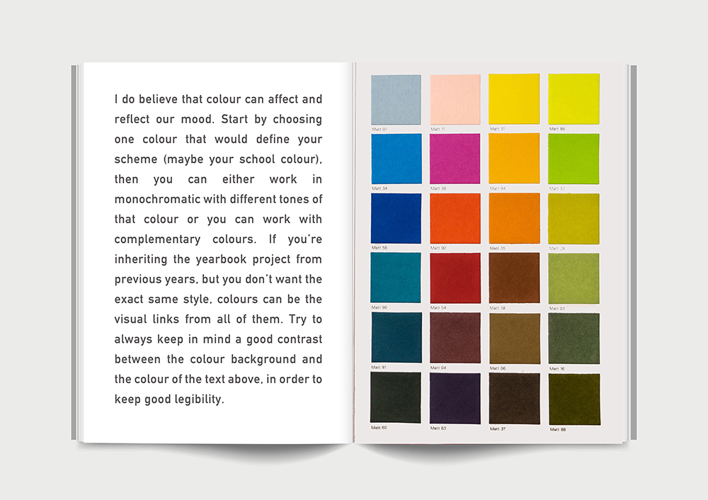
I do believe that colour can affect and reflect our mood. Start by choosing one colour that would define your scheme (maybe your school colour), then you can either work in monochromatic with different tones of that colour or you can work with complementary colours. If you’re inheriting the yearbook project from previous years, but you don’t want the exact same style, colours can be the visual links from all of them. Try to always keep in mind a good contrast between the colour background and the colour of the text above, in order to keep good legibility.
If you need any assistance with your cover, or designing a custom cover, we have some information here which you might find useful. Otherwise, do get in touch with the team if you have any ideas you need help with!
Carlyne is a graphic designer based in London – you can find her on Linkedin at:https://www.linkedin.com/in/carlyne-wetterwald-671b2060/