2021 has been another unusual year, and it’s been great to see such collaboration and creativity shown by this year’s yearbook editing teams.
From hand drawn custom covers, to illustrations and incredible artwork, this year’s editors have really put a unique stamp on our cover templates.
If you’re stuck for cover inspiration, we recommend heading to our Instagram page @yearbookmachine, where we post our favourite covers throughout the year. Pinterest and Instagram can also be great resources for inspiration – take a look at the #bookdesign and #bookcover tags on these platforms.
Below are some of our favourite covers from this year’s cohort. We hope they give you some great ideas for 2022!
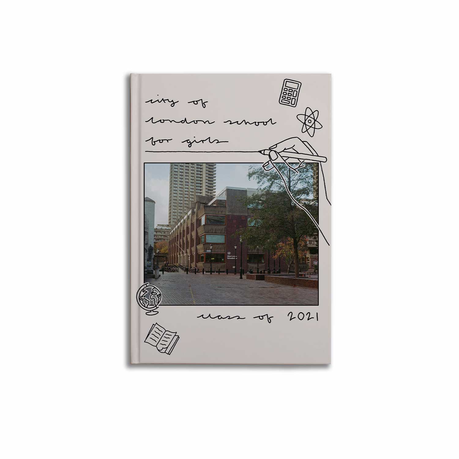
Custom Photo Cover
We love the personal touches on this cover – the doodle illustrations put a unique stamp on the photo of the school. The cover’s colour scheme draws on the tones of the photograph and the Barbican estate surrounding the school, and the cover’s matte finish helps to add to its modern feel.
To create something similar for your book, start with a photo of your school. Look for inspiration in the school’s landscape for a background colour, and find fonts and vectors online that can be added to the cover file using Photoshop or similar software.
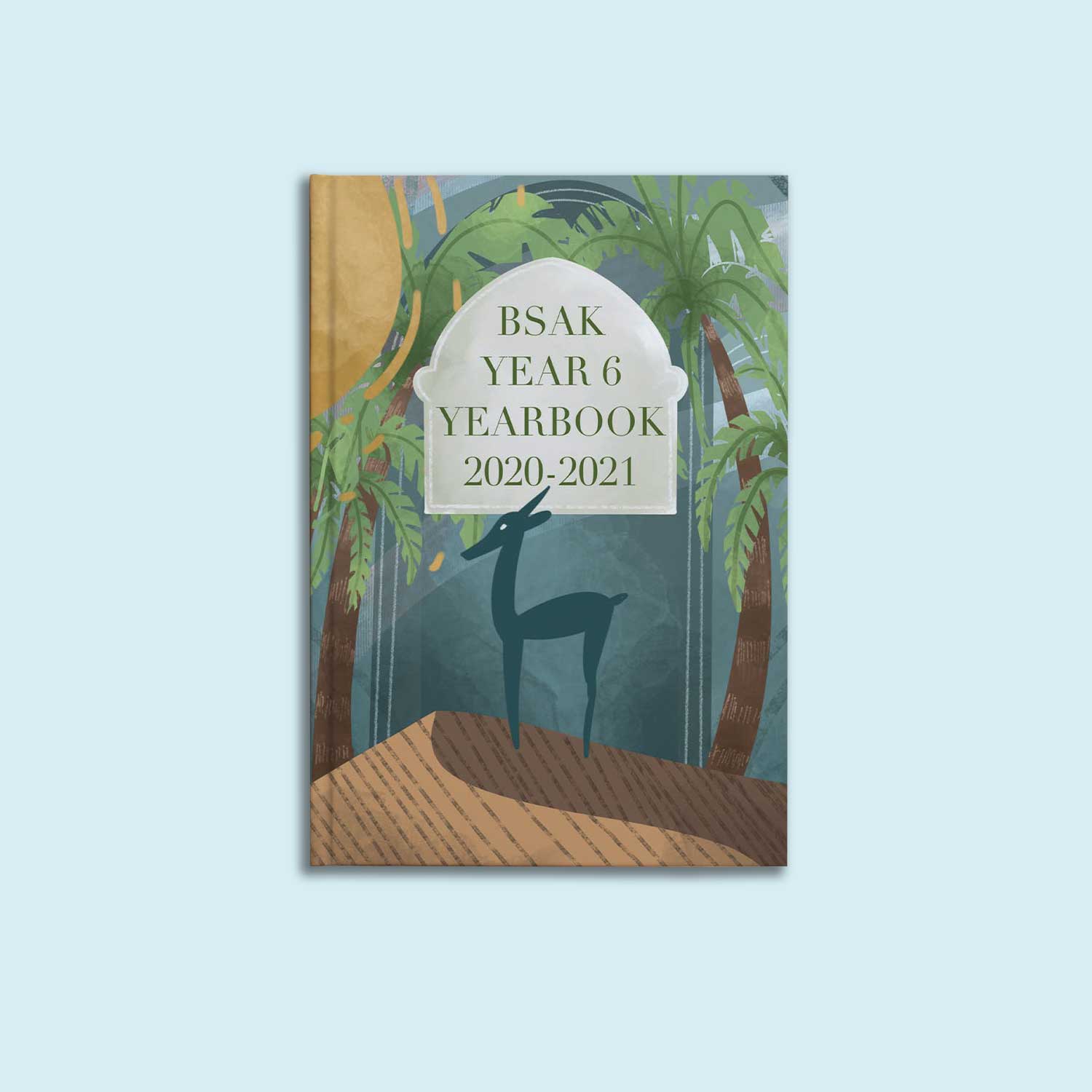
Illustration
This cover utilises the school’s logo as inspiration in a great way – taking the camel in the logo and using it as the jumping off point for a desert inspired scene on the cover. The colours used compliment the school colours; without just relying on the blues and yellows present in the school’s logo.
To create something similar for your book, take a look around your school’s logo, grounds, buildings and uniform. Are there any unique features, colours or emblems that could provide ideas for your cover? If there are any talented illustrators or artists in your leavers group, see if they’d like to lend a hand. This design was done digitally in a program like Photoshop; but designs could also be done by hand, scanned into a computer and coloured using editing software.
Traditional Big Logo
This school’s unusual logo is given the chance to pop on a neutral background, incorporating the navy blues from the school’s colours. We love how these editors have used some of the most frequently seen school colours in a new way, with the off-white background keeping everything looking modern and fresh.
If you want to recreate something similar, think about what colours and colour combinations might compliment your school logo or uniform colours. If your school colours clash, consider using one school colour and a neutral like a white, cream or grey alongside it. There’s a great online resource here to help you find complementing colour schemes that you might not have considered.
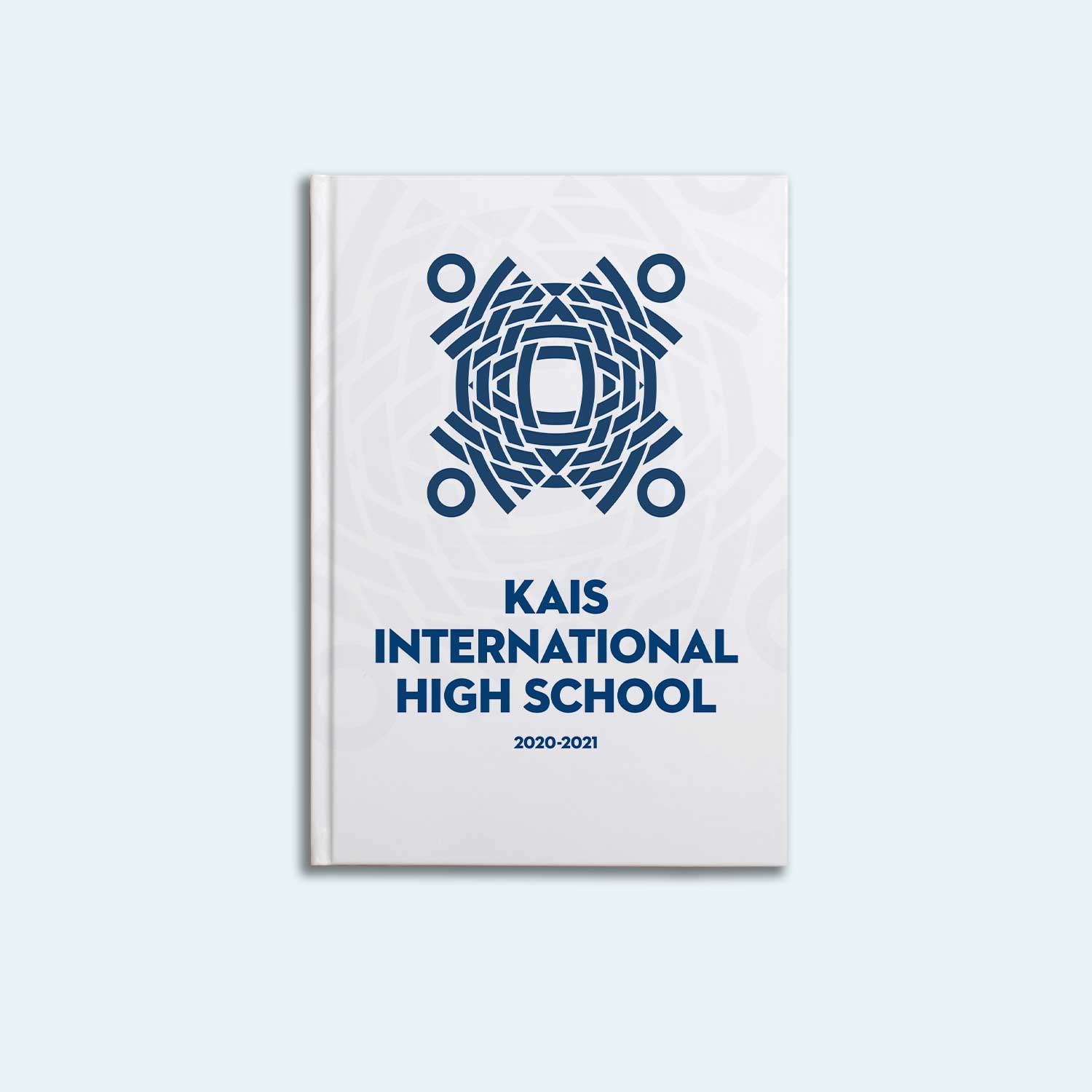
Photo Cover
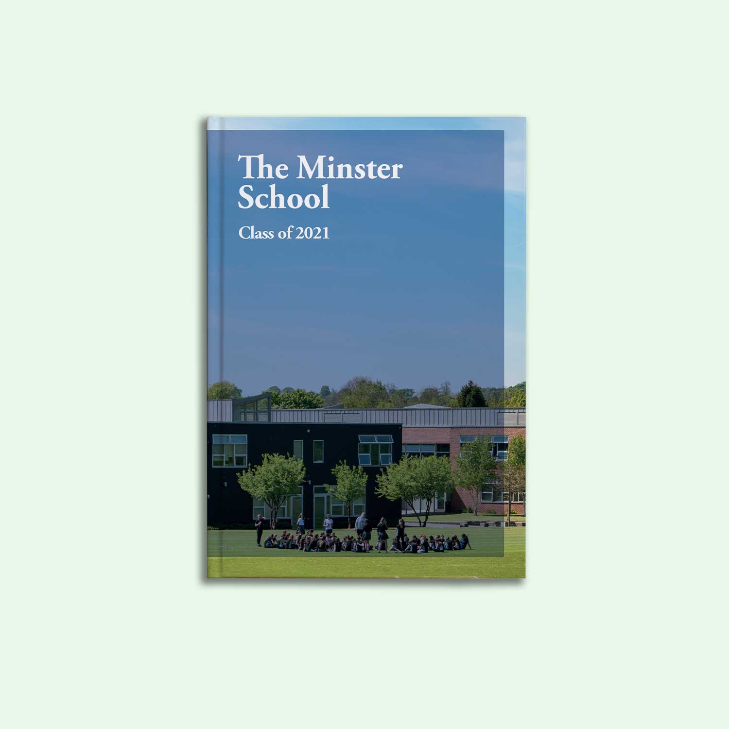
Sometimes keeping things simple is all that’s needed – you can never go wrong with a photo cover using a good picture of the school taken on a bright sunny day. The school building and grounds are immortalised forever on the front of the yearbook, and a candid group shot of the leavers group adds a really good personal touch to the cover.
Any photo taken on a modern camera phone will generally be of great quality to use in your yearbooks; but for your cover, the higher resolution the image, the better! To recreate a cover design like this, choose our ‘Photo 1’ cover from the Cover Editor area, and head out to take a picture of your school on a day with plenty of natural light. If you can get hold of a professional camera for this (or even borrow one from your school – an art or drama department might have one), your cover image will be super crisp and clear.
Logo & Arrows
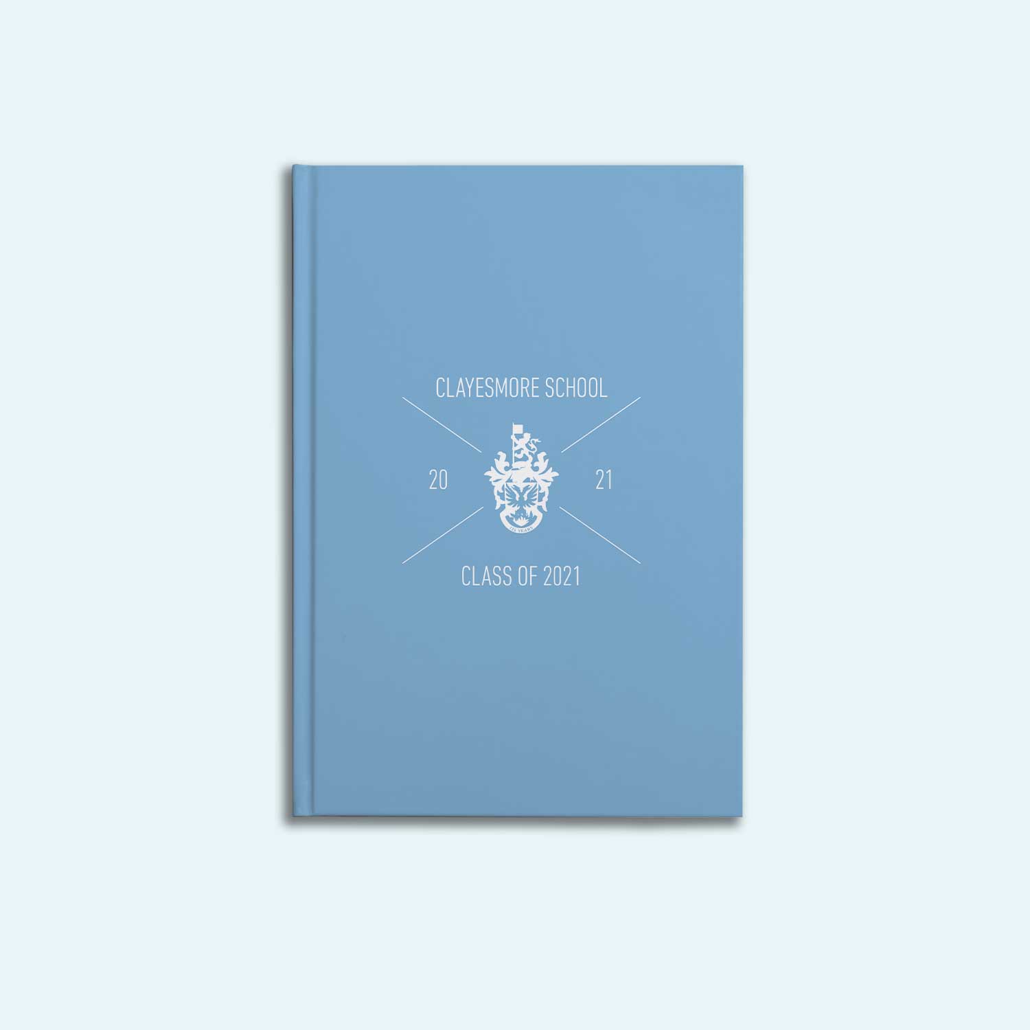
If your school or university has a crest as its logo, our Logo & Arrows template is a great way to incorporate it into your book cover. We love the light blue and white colour scheme that this school has gone for – it’s a great way of modernising a formal crest.
If you’d like to create a similar cover, head to our Cover Editor and choose the Logo & Arrows option. This template looks great with lighter colours and white text, but can also work with darker colours if needed. Crucially, our design team recommends keeping your front cover text as short as possible with this template, to ensure that everything fits really neatly and symmetrically into the arrows.
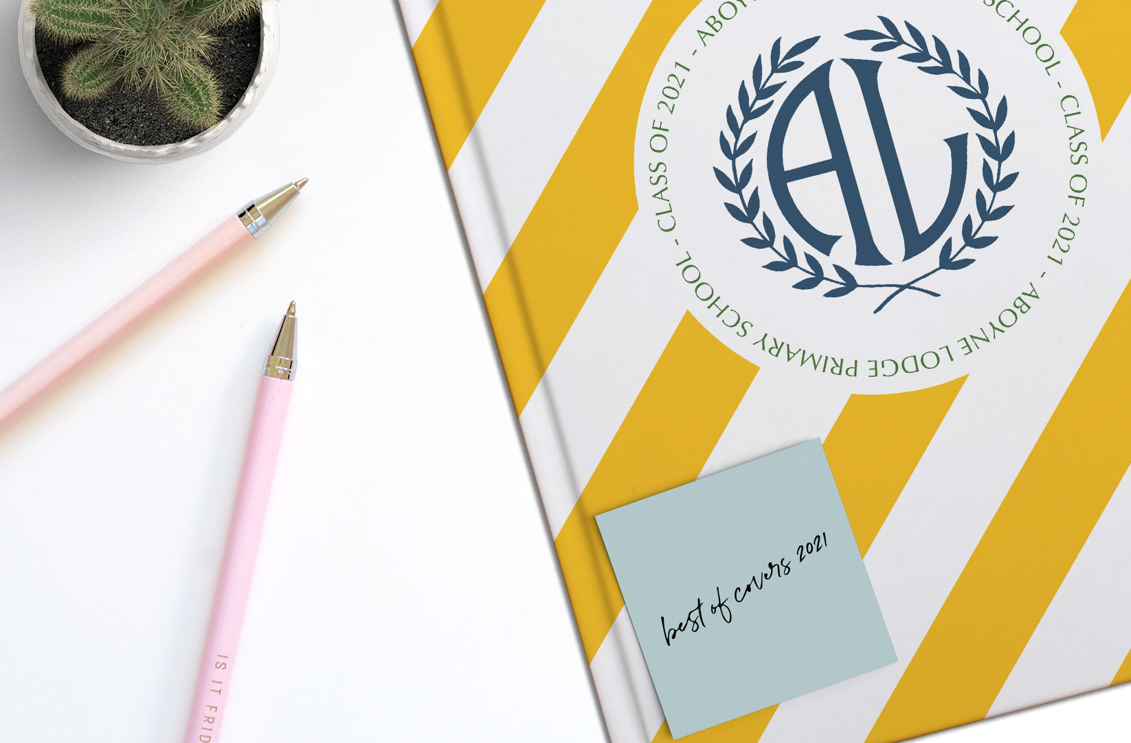
Diagonal Stripes
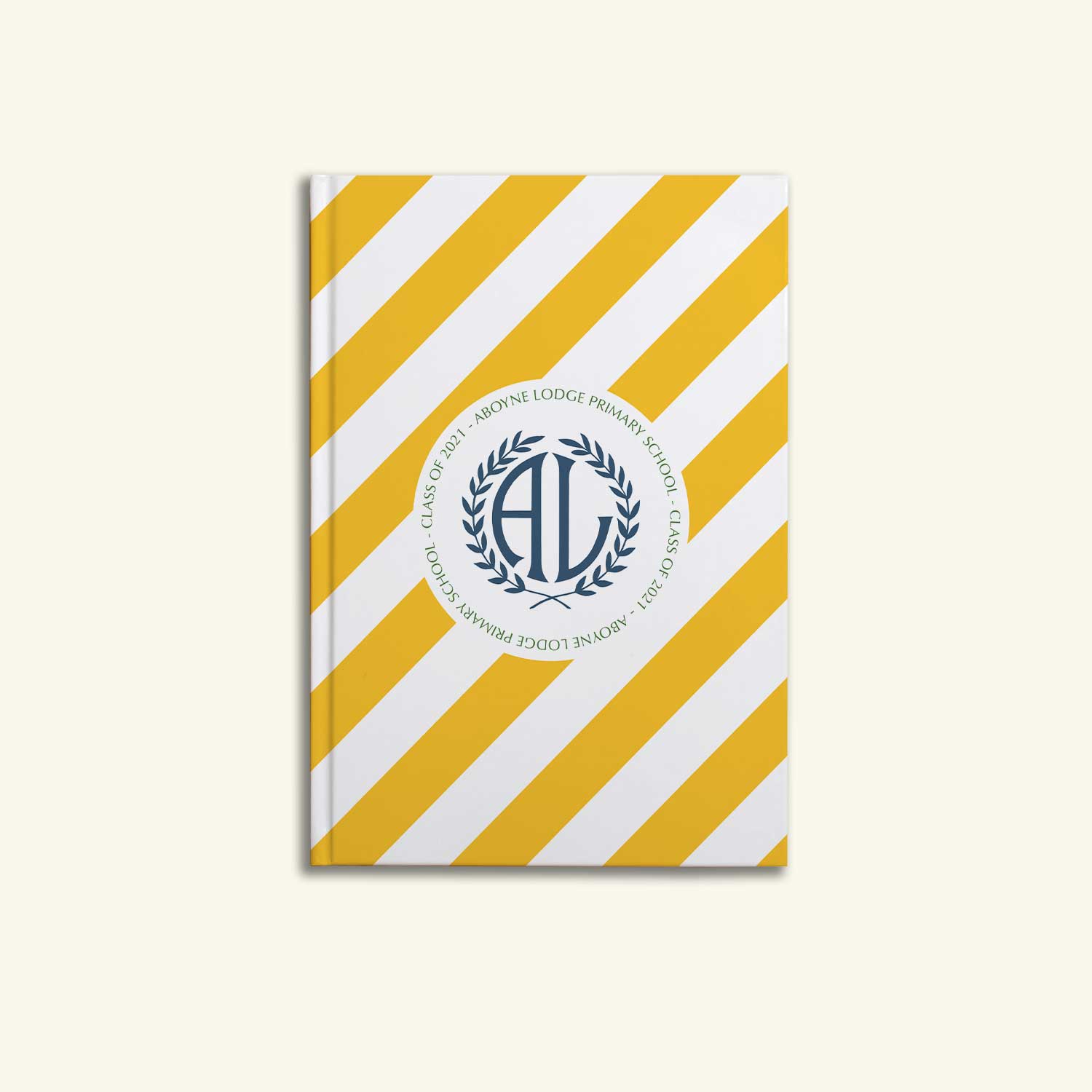
We love how the yellow and white stripes on this cover stand out! The Diagonal Stripes template is great when used with bold bright colours. The shape of the school’s logo compliments the circle in the middle of the design, and the green font nods to the school uniform colour scheme.
To recreate this cover in your book, choose the Diagonal Stripes template from your Cover Editor. This template looks great with solid, bright colours – if your school colours are pale, you can always implement a darker shade instead!
As always, if you have a cover idea and aren’t sure how to make it a reality, get in touch with us on support@yearbook.com – we’d be happy to help.


