From your very first page until your very last; there’s no doubt – every editor wants their book to stand out from the crowd. Of course, more importantly – every editor wants to upstage the book from the year above.
Good news: our system is full of features to personalise, customise and really make your book your own, and we have tons of tips, tricks and past ideas to get you started.
Judge a book by its cover
If you’re trying to stand out, a photo cover is a great way to remember the school or university you’re leaving behind. Photo covers are an easy way to make your book more personal, without being too difficult to put together. It’s likely that your school office will already have a high-res photo that they use for marketing; or, borrow a camera and take a picture on a nice day.
Or – go completely custom! Use your cover to capture a moment from the past year, or get your class artist to make something totally unique in photoshop. Our Instagram has featured some of our most recent favourites, and there’s really no limit to what you can do with the format.
We’ve seen illustrated covers, photo montages, and photoshopped dedications to teachers take centre stage on yearbook covers. Why not rework something that made everyone laugh in your leaving year, or find a way to work in your house colours?

Section dividers – making it personal
Our system provides logo section dividers by default; but, there’s much more things you can do to make your section dividers stand out.
If someone in your year is known for being super creative, ask them to draw a section divider – maybe caricaturing a favourite teacher, or showing the evolution of your year group right through from Year 7 to Year 13. The best section dividers are usually the most personal!
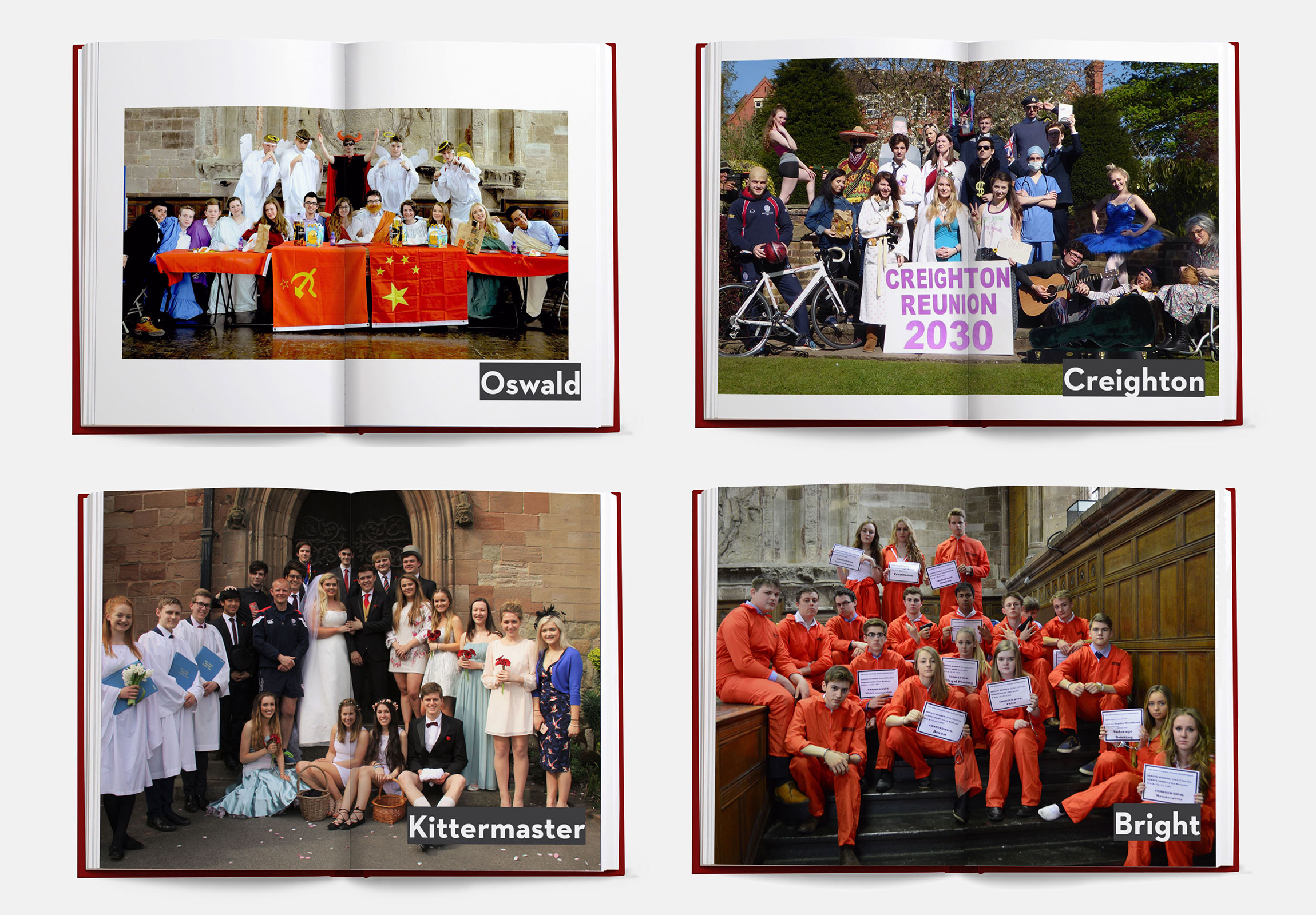
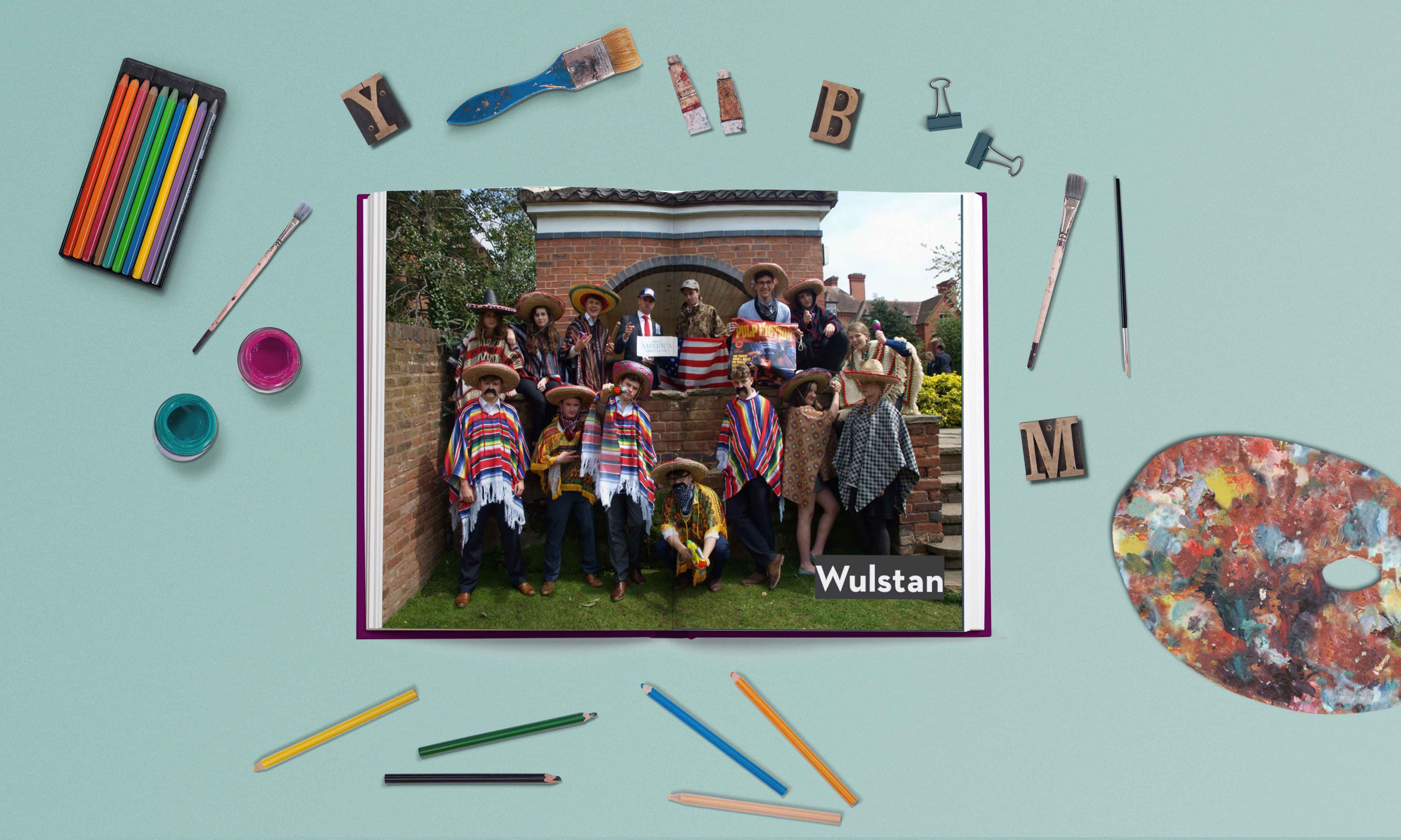
Tight for time? Use a photo to customise your section dividers. If your book’s divided up into houses or classes, give each house a dress up theme, and challenge them to create the best section divider. It will appeal to their competitive side, and create a totally unique section divider for your book.

Styles and colour schemes
When choosing your colour scheme, get creative – every section can have it’s own! A colour scheme done right is a great way of making your book look professional, and tying together all your sections.
But before you turn your book into a multicoloured canvas – know that some colours play nicer than others! Always have one dark and one light colour, instead of two bright colours together.
Likewise – don’t make a beeline straight for your school colours. If you hated your school uniform, you might not want to feature its colours on a book you’ll keep forever! If your school has a crest, pick out two complimentary colours from the crest and use them instead. Or, use house colours to keep things relevant, without being predictable.
Stuck for inspiration? Try colour matching! There’s a free tool on the Adobe website that helps you to find complimentary colours, and it’s a quick way of picking out a great colour scheme.
And as a general rule, never use black as one of the colours in your book – switch it out for a dark grey instead.

Photos
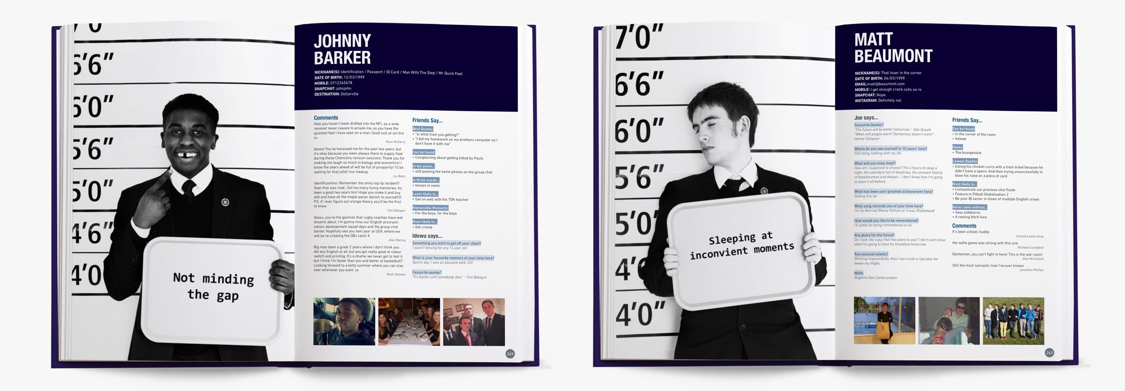
While yearbook pictures can be A Huge Deal, they’re also a chance to showcase your year group’s sense of humour. Some of the most memorable books that we’ve seen have themed profile pictures – think along the lines of convict lineups, celebrity lookalikes and fancy dress.
Alternatively, use a montage of Year 7 or baby pictures to show the world how much you’ve changed. Or even better – recreating these pictures now you’re older. For department pages, dress up as your subjects, or use props to represent what you’ve been studying.
Recently, some of the most popular montages that we’ve seen have been social media ‘Best Of..’ pages, full of phone screenshots of the funniest things that have happened on these platforms all year. It’s a great way of collecting all of these and putting them all in one place when you and your classmates might be going your separate ways soon.

Endpapers
As the very first and very last thing you see in your book, endpapers can be an important addition to your yearbook. Photo endpapers can be a good way of marking the passage of time – a group picture from your first year of school and one from your last makes a really personal touch. Alternatively, get your year together to take an informal picture – it’s probably never been done before, and is a great way to get a relaxed group picture, without the pressure of school picture day.
Or – you can keep endpapers simple. School colours add a pop of colour to your book, and make for a professional looking product. A picture of your school or college looking photogenic on a nice day is also a good way to pay tribute to your school, and can be a good bookend for all the memories in your book.


